We'll all probably agree that food is love. But food also carries a lot of wisdom and metaphors for real life. Take Ayurveda, for instance – meals that contain too many spices or ingredients lead to overstimulation. This contributes to confusion, impatience, irritability, or an inability to make decisions.
Are you asking why an IT company is giving you a lesson in Ayurveda now? While we are gourmands and enjoy getting lost in delicious recipes, we're not venturing into culinary waters just yet. We simply strongly believe that we are what we consume. And we're not just talking about food right now. Try to reflect for a second on how you feel when you have too many stimuli around you – how many times have you felt practically paralyzed?
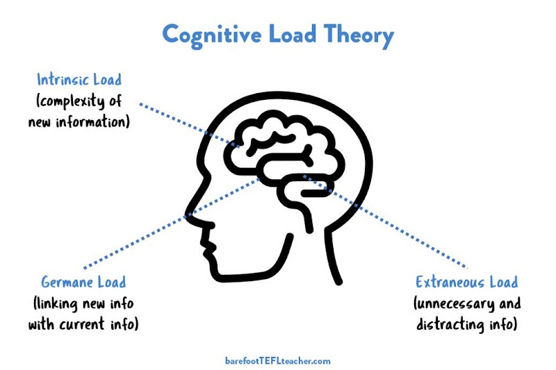
Let's take an example that many of you will surely relate to. You're on a busy street full of flashing lights, billboards, and noise. It's shopping street in Bratislava in all its glory. Every building is different (one historic, one modern, and a third falling apart), and each one has at least 5 stickers and 15 advertisements. Everywhere you look, there are visual attractions practically screaming at you. And your brain? It's received a serious dose. cognitive load and switches to „escape“ mode.
Source: www.barefootteflteacher.com
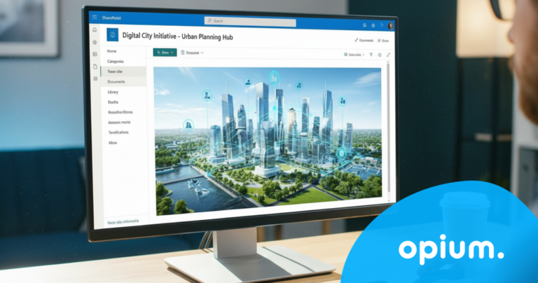
This is exactly what most corporate dashboards look like – color palettes, endless widgets, dynamic charts, everything in one place. Absolute chaos. If we think about the actual purpose of a corporate dashboard, we come to one conclusion: Less is more.
Every new notification or email pulls us out of our focus zone. That's why a company dashboard must be designed to minimize these disruptive elements. Less distraction means more focus on what's essential. And that's the whole point – less interactivity, more effectiveness. A dashboard that offers clear, concise, and static data without unnecessary effects will hold attention longer and ensure faster decision-making. If you want results, you don't need clutter.
Analysis paralysis
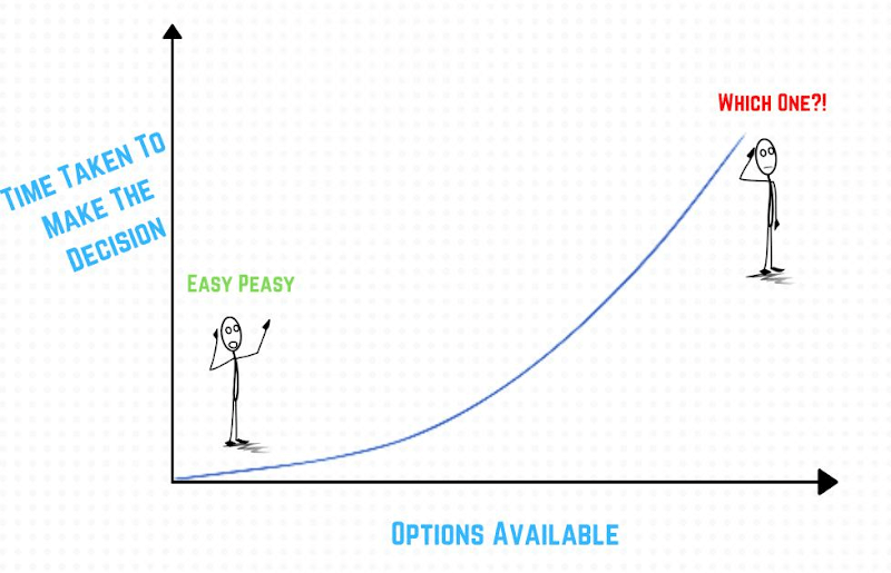
Introducing another juicy expression that we experience on a daily basis without giving it much thought. Analysis paralysis. This is a phenomenon where The amount of data overloads our brains so much that we can't make any decisions..Because too much information = too many choices. And this is where we start going in circles like a hamster on a wheel.
Dashboards with dozens of graphs and indicators may look sexy, but they don't actually bring anything other than delays. Every extra click means wasted time and reduced efficiency. And let's be honest – do you have that much spare time to waste?
Source: https://thealiendesign.medium.com/
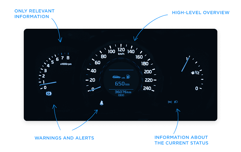
A corporate dashboard should be like a car's dashboard.
Every designer knows they only have 5 seconds to capture a user's attention. And that's probably saying a lot. Whether it's a website, an app, or a dashboard, the same rule applies everywhere. If your dashboard can't deliver relevant and clear information in that short time, something is wrong. Is it really necessary for everything to „pop,“ „scroll,“ and „spin“? No. The key to not overwhelming users with data or complex features is to provide them with all they need.
But how do you find out what's relevant?Let's look at it practically. A car's dashboard doesn't show details about the brand's history or recommendations for the nearest burger. It only displays the most important things: speed, fuel level, engine RPM, distance traveled, or warnings when something isn't working correctly. And that's exactly how your dashboard should function. Fewer graphs, fewer complicated features, and fewer interactions. The most important data should be visible and immediately available.
And now you're probably asking yourself - “Alright, but how do we distinguish which data is key for our company dashboard?" Because sometimes it's not as clear as day. The answer can be found in user research.These data are used to identify the essential information that will be most important to users. We do not recommend blindly trusting only your own preferences or taste. This is doubly true if you are a manager and tenfold if you are a business owner. You must know what your colleagues, employees, or bosses actually need to see. Without this feedback, you risk the dashboard ending up as just more visual clutter.
We understand you want your dashboard to look hot and grab attention like an open bar at a company event. But beware! Functionality must not come at the expense of appearance. This golden rule applies always and everywhere. Yes, even when you're trying to squeeze into jeans a size smaller, telling yourself you'll run it off. No, you won't. (Though we're rooting for you). You'll suffer for a while, then give up, and eventually, they'll hang in your closet, sadly gathering dust. Just like your overstimulated dashboard.
Before you dive into design, measure your business goals and find out which key performance indicators (KPIs) are your holy grail. Be inspired by minimalist aesthetics and choose the path of fewer clicks, less visual clutter, and focus on a clear and simple display of key data. And don't forget: UX research will provide valuable insights into what your colleagues are really looking for and using. With this data, you'll be able to select the best KPIs for your dashboard, which will exude the appeal of Scandinavian minimalism while functioning like a Swiss watch!
Share post
Article content
Do you know where exactly you're wasting time and money?
Launch our NONSENSE SCANNER. In 3 minutes, you'll find out how much precious time and money you're actually burning on unnecessary operations.
We use technologies such as cookies to store and/or access device information to provide the best experience. Consenting to these technologies will allow us to process data such as browsing behavior or unique IDs on this site. Not consenting or withdrawing consent may adversely affect certain features and functions.
Functional
Always active
Technical storage or access is necessary for the legitimate purpose of enabling the use of a specific service explicitly requested by the subscriber or user, or solely for the purpose of transmitting a communication over an electronic communication network.
Preferences
The technical storage or access is necessary for the legitimate purpose of storing preferences that are not requested by the subscriber or user.
Statistics
Technical storage or access that is used exclusively for statistical purposes.A technical storage or access that is used exclusively for anonymous statistical purposes. Without a subpoena, voluntary compliance by your Internet Service Provider, or additional records from a third party, information stored or retrieved solely for this purpose can usually not be used to identify you.
Marketing
Technical storage or access is necessary to create user profiles for ad serving or user tracking on a website or across multiple websites for similar marketing purposes.